Your shop looks like a random camera roll. Matching the backgrounds is the weakest fix for it.
It is the advice everyone gives and it does work, which is why nobody looks past it: pick one background, lock your tones, apply them to every SKU. But that is consistency of finish. What makes a set of images recognisable as somebody's is repeated layout, repeated motifs, repeated type — and that was out of reach for a one-person shop for a very specific reason that no longer holds.
The question
Hours per photo — lighting, angles, editing — and the shop still looks off. Then the switch that finally works: stop chasing the perfect shot, keep the tones and backgrounds the same across everything, and suddenly it reads as a brand instead of a pile of pictures. A small-business owner who shoots and edits on their phone described exactly that turn in r/smallbusiness on 16 April 2026, and asked what other people do. The two best answers agreed and sharpened it:
Once the backgrounds and tones are locked in, everything starts to look intentional even if individual shots aren't perfect.
And, from someone describing the same jump:
The big jump was making every listing follow one visual system instead of chasing one perfect shot. My store finally stopped looking like a random camera roll.
The first reply is more right than it knows
"Individual shots don't have to be perfect" is the most useful sentence in the thread, and the reason it is true is bigger than the reason given. It is not that a matching background hides a mediocre photograph. It is that recognition does not live in the photograph at all. It lives in the things that repeat.
Think about which brands you can identify from a thumbnail, before reading a word. You are not recognising their white balance. You are recognising a layout — where the product sits, how big the type is, what shape the colour blocks are, whether there is a border, which two or three motifs keep turning up. Those are decisions, and they repeat.
A shared background is the cheapest version of this, and it happens to be the only version a person can execute by hand across forty SKUs.
That last clause is the whole reason the advice stops where it does. Carrying a layout across forty products means designing a template and then fitting each product into it — a designer's afternoon per SKU, or a system nobody has time to build. So the advice everyone gives is the advice that fits in the budget, and it has been repeated so long that it now reads as the ceiling rather than the floor.
What repeating the decisions actually looks like
Below are four takes from our own library. They are four unrelated products — a yogurt soda can, a navy snapback, a black office chair, a white handheld device — with nothing in common: different categories, different shapes, different owners of the problem. Every one was made by pointing at the same reference.
One reference, four products that have nothing to do with each other
Four separate plans, each written from the same reference image, each run against a different product photo. All at 1K, nothing retouched.
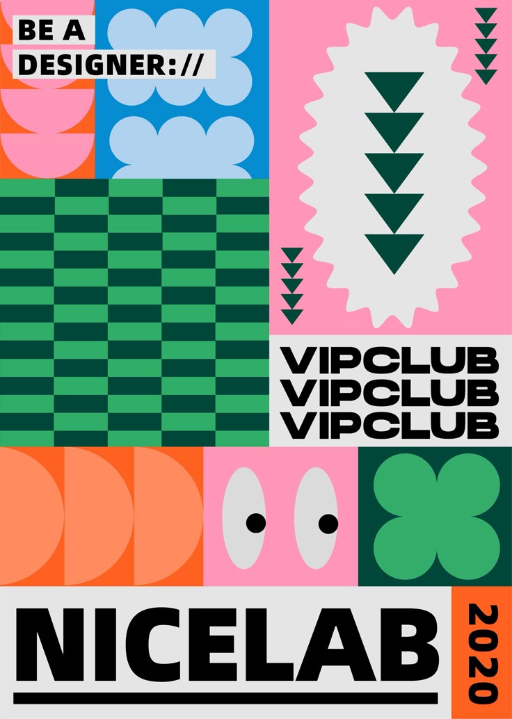
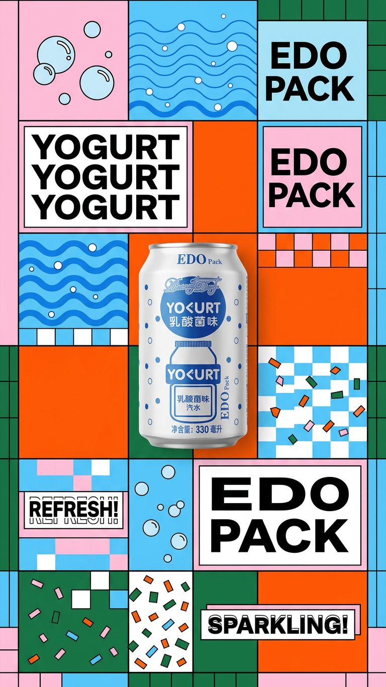
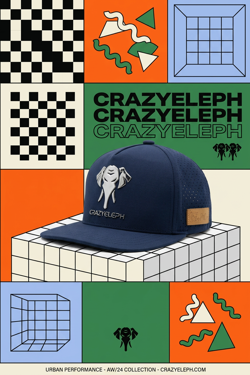
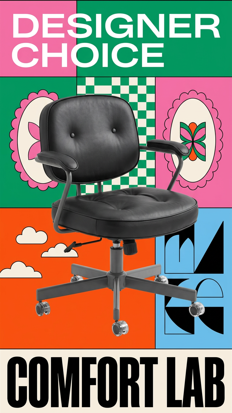
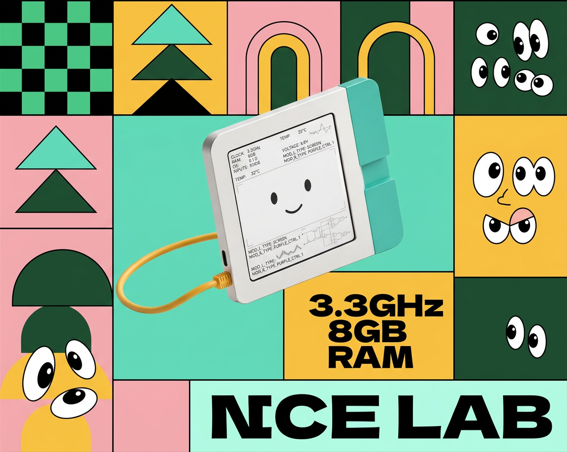
What repeats is not a colour. It is the modular grid of blocks, the checkerboard, the flat cartoon motifs, the heavy condensed type sitting hard against an edge. Four products that would never appear in the same catalogue read as one campaign — and the recognition survives at thumbnail size, which is the only size that matters in a feed. Try it with a reference of your own → free · two images a day
Where this stops
It is the same system, not the same template. Look again and the palettes are not identical — one leans pink and blue, another orange and cream. Each image is generated, so each run re-rolls the details. If you need pixel-identical framing across a catalogue, that is a template and you should build one; what this gives you is a family resemblance, which is a real thing but a looser one. Be honest with yourself about which you need.
A look is not a brand. Repeating visual decisions makes you recognisable. It does not make you worth recognising — that is still the product, the writing and what you promise. This solves the "random camera roll" problem and no other one.
And not on your product pages. Everything above is for the feed and the ad. A generated image can quietly change a detail of the product itself, which is a returns problem rather than an aesthetic one, and I have written up what that looks like when it happens. Keep at least one plain, boring, this-is-what-you-get photograph per SKU, shot by you.
You already have the shots. The thing missing is the repeat.
Take one reference whose layout you would be happy to be known for, and run your products through it one at a time. You get the plan in sentences for each, so the decisions that repeat are visible rather than a setting you hope is still on.
Two free images a day. No card, nothing to cancel.
Sources.
- The thread: “How do you make product photos look more ‘brand-like’?”, r/smallbusiness, 16 April 2026, read on 18 September 2026. Both quoted replies are theirs; two of the four name a tool and the page says so.
- The four takes are from our own library, each a separate plan written from one shared reference image and run against a different product photograph. Nothing retouched.
- Disclosure: I build Swipe60, which is how the four images were made. “Where this stops” is there because of that, not despite it.