You don’t need a ComfyUI graph for AI product ads. You need the four rules underneath it.
Ask how the good AI product ads actually get made and the answer is a pipeline: a ComfyUI graph, model routing, batch generation, a review step, A/B testing. Almost none of that is the part that works. The part that works is four rules about what is allowed to change, it fits in a paragraph, and you can follow it with anything — including by hand.
The question
Here is how one person arrived at that pipeline, and at the four rules under it. He had been shopping for a camping french press, scrolled past five listings with perfectly good studio photos, and stopped on one that looked unreal in a good way — metal glowing in a hyper-perfect sunset, coffee beans scattered on a log like movie props, steam looping. He wrote it up in r/advertising on 30 August 2026.
He had already decided to buy. He clicked because he wanted to know how the picture was made, and then caught himself: two whole minutes on a listing he would normally have scrolled past.
A friend of his who buys media for a few DTC brands was not surprised. Teams are deliberately testing these exaggerated product scenes. And the friend described the setup: a ComfyUI graph, an API layer so models can be swapped without rebuilding the graph, a current-generation image model to relight the scene and swap environments while the product stays locked, then batches of variations across lighting, environment and composition to compare directions.
Then he wrote the part worth keeping, and I don't think he noticed he had answered himself:
They don't treat one generated image as the final ad. Lock the product details that have to stay accurate, push one variable at a time, generate a batch, shortlist the usable ones, send those to testing.
And the aim, in his words, is not to make every image as extreme as possible. It is to find the point where a stylised environment buys enough attention without changing what buyers think they are getting.
He ended by asking media buyers how they structure the graph, the routing, the batching, the review. Nobody replied. Two weeks later the thread still has no answers in it.
What he would find if he went looking
I looked at the first page of Google for the phrase he would most likely type, on 12 September 2026. It is comfy.org's own starter workflows, two more comfy.org pages, a "Midjourney + ComfyUI = perfect product photography" post, a YouTube composite-and-relighting tutorial, and a handful of blogs walking through node graphs.
Every one of them teaches the graph. Not one of them is about the thing he actually asked, which was where do the guardrails go — what is allowed to move, what must not, and which number kills a direction before it scales. Those are not node questions. You can build a beautiful graph and have no answer to any of them.
The discipline, separated from the software
Written out, his friend's process is four rules. None of them mention a tool.
1. Decide what is locked before you generate anything
Not after, when you are looking at a picture you like and negotiating with yourself. Before. For a physical product the list is short and specific: the shape, the finish, the label, the stone count, the closure, where the logo sits. Anything a customer could hold up against the box and find different.
2. Move one variable per batch
Light, or environment, or crop — one. This is the rule people skip, because generating is cheap and it is tempting to change three things and keep the best of eight. Do that and you learn nothing: you cannot tell which change bought the attention, so the next round is guessing again. His whole point about exaggeration only works if you know which dial you turned.
3. Shortlist by looking, not by liking
The question is not "is this nice". It is "does this stop a scroll, and does it still describe what I ship". Two questions, both answerable by looking at the picture next to the real product.
4. Name the number that kills a direction
His sharpest line is a warning about this: click-through tells you which version stopped the scroll, and tells you nothing about whether the product framing survived to the landing page and the purchase. A direction that wins on CTR and quietly lifts returns is not a winner, and CTR will never say so.
Where the software becomes optional
A ComfyUI graph is one way to make those four rules enforceable. Nodes hold a variable still. The graph is reproducible. If you run several brands and a few hundred SKUs, that reproducibility is the whole job, and you should build it.
But look at what the rules actually require. Rule 1 needs somewhere to write down what is locked. Rule 2 needs to change one thing and re-run. Rule 3 needs the attempts to be cheap enough that you throw most away. Nothing in that list is a node.
What we build reaches the same rules from the other end. You give a reference and a photo of your product, and get back a plan in plain sentences plus the first image built from it. The locked list is a line you can read. Moving one variable is editing one line and pressing generate again. An attempt costs one point. There is no graph, and for one person with one product there does not need to be.
Rule 2, actually done
One reference, one phone photo, and then the same plan with a single line changed. Both at 1K, nothing retouched.
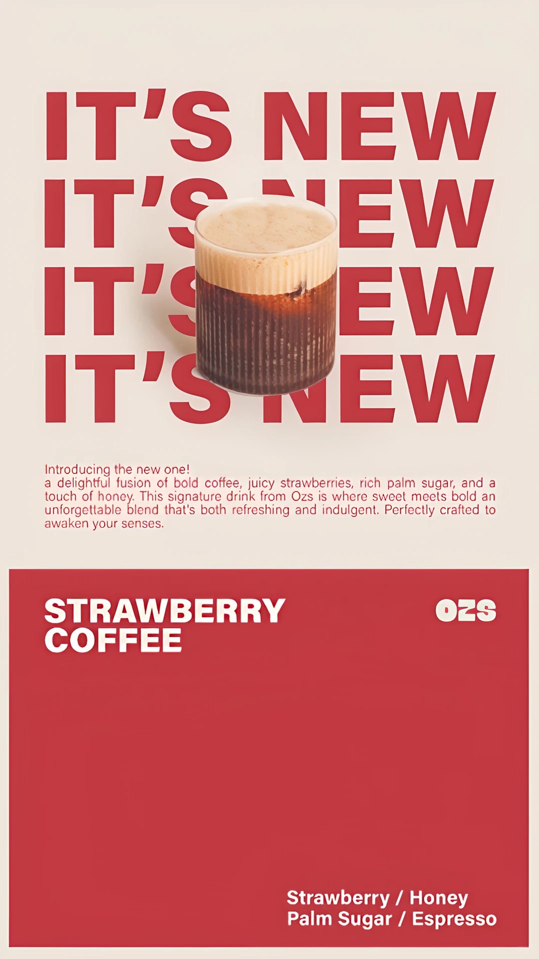



Two generations, two points — the whole cost of running rule 2 once. Now look at what actually happened. The structure held exactly: four stacked rows of type, the product hovering over them, the navy footer slab, URBAN SERIES, the spec list. But the model also re-shot the cap at a different angle and rewrote the body copy, and the plan asked for neither. That is the practical difficulty with rule 2 and it is worth knowing before you rely on it — you move one variable and the generator moves three more, so attribution is still work. Try it with your own reference → free · two images a day
Where this stops
It does not answer his last question, and neither does anything else. Whether the product framing held up through the landing page and the purchase is not visible in any image tool, ours included. The only instruments that report it are returns, complaints and the support inbox, and they report it late. That is the real argument for rule 1 being strict: the failure arrives weeks after the decision, attached to a customer.
If you are running batches across many SKUs, build the graph. Reproducibility across two hundred products, deterministic re-runs, routing between models per job — those are real needs and we do not serve them. This is for the person with one product and a reference, who needs the next picture this week.
Exaggeration is a dial, not a direction. His friend's point deserves repeating because it is the easiest thing to get wrong once generating is cheap: the aim is the point where a stylised scene earns attention without misdescribing the product. Past that point you have bought a click and sold a disappointment.
You already have the reference.
Upload it with a phone photo of your product, and you get the plan — the locked list and the variables, in sentences — plus the first image from it. Then change one line.
Two free images a day. No card, nothing to cancel.
Sources.
- The thread: “What does a real ComfyUI workflow for testing hyper-perfect product shots actually look like?”, r/advertising, 30 August 2026 — the listing, the workflow and the four rules are his account of his friend's process. Read on 12 September 2026, at which point it had no replies.
- The first page of Google results described above was pulled on 12 September 2026 for “comfyui product photography reference image”, US, desktop.
- Disclosure: I build Swipe60, which does the reference-plus-product step with an editable plan. “Where this stops” exists because of that, not despite it.