Your inspiration folder isn't disorganised. It's undescribed.
Better folders will not fix it. An image cannot be searched for the thing you actually need from it, so a saved reference stays unusable until somebody puts it into words — and that step is invisible work the designers who are good at this are already doing by hand. Three of them describe three different workflows below, and all three are quietly doing it.
The question
Pinterest, screenshots, Figma boards, four or five folders on the desktop. Plenty saved — and then, at the moment of actually designing, none of it gets opened. A designer put the loop into words in r/Design on 19 March 2026:
Scroll for a bit. Get a vague sense of direction. Then start designing from scratch anyway.
The part they named as the struggle is translating inspiration into actual decisions: type scale, spacing, layout patterns, colour usage. And a second complaint at the end, which sounds like a footnote and isn't: everything is scattered across four or five places and it's a mess.
What the thread told them
Three replies, three different workflows:
- Break it down at save time. One designer treats saved inspiration like a component library: screenshot the spacing between elements, note the type sizes, save the palette separately. Thirty extra seconds per save. Stored in Notion under tags like "navigation patterns" or "card layouts", so that being stuck on spacing means searching for spacing rather than scrolling past two hundred random saves.
- Break it down at design time. Another says most people never translate directly, they just absorb patterns over time — and what helps is picking two or three references and literally copying the spacing, the type scale, the layout once, until it clicks. After that you need the references less, because it has become instinct.
- Don't keep a catalogue at all. A third only looks for reference project by project. An endless scroll through a mega-folder of varying vibes is no help. And a line worth keeping: they don't find reference useful for spacing and type scale anyway — more layout and colour.
All three are good answers. Notice what happens if you put them side by side.
The step nobody named
Every one of those workflows is the same act performed at a different moment. Screenshot the spacing, note the type sizes, save the palette apart. Copy the spacing and the type scale by hand once. Pull out the few relevant bits per project. In each case the designer is turning a picture into a set of named parts before it can be used — and doing it by hand, and counting the cost in seconds.
The gap between a saved image and a design decision is a description step. It is real labour, and the thread performs it three times without ever giving it a name.
Which also explains the complaint that looked like a footnote. A folder does not help because an image is not searchable by the thing you need from it. You need "a card layout with generous spacing"; what you have is a JPEG of one. The Notion tags in the first answer are a hand-built index over descriptions that a person wrote — the organising works because the describing happened first. You cannot file what you have not described. Four scattered folders is not a storage problem downstream of a tooling choice; it is what an undescribed pile looks like.
And one more thing the thread shows by omission: the original poster asked a good follow-up — when you break a reference down, do you store the pieces separately or tied back to the original, and when you design, do you go and search them or do you just remember? Nobody answered. The honest answer is that if the description is text, it is searchable, and if it lives in your head, it isn't.
Scope, before the demonstration
What it looks like when the description is done for you
Below is a real sample from our own homepage — anyone can open it and read the whole thing. A reference somebody saved, their own product as they actually had it (a navy snapback on a kitchen counter, next to a mug and a packet of tissues), and what came back.
The reference, and the same treatment on a phone photo
One generation at 1K. Nothing retouched. Live on the homepage as a public sample.


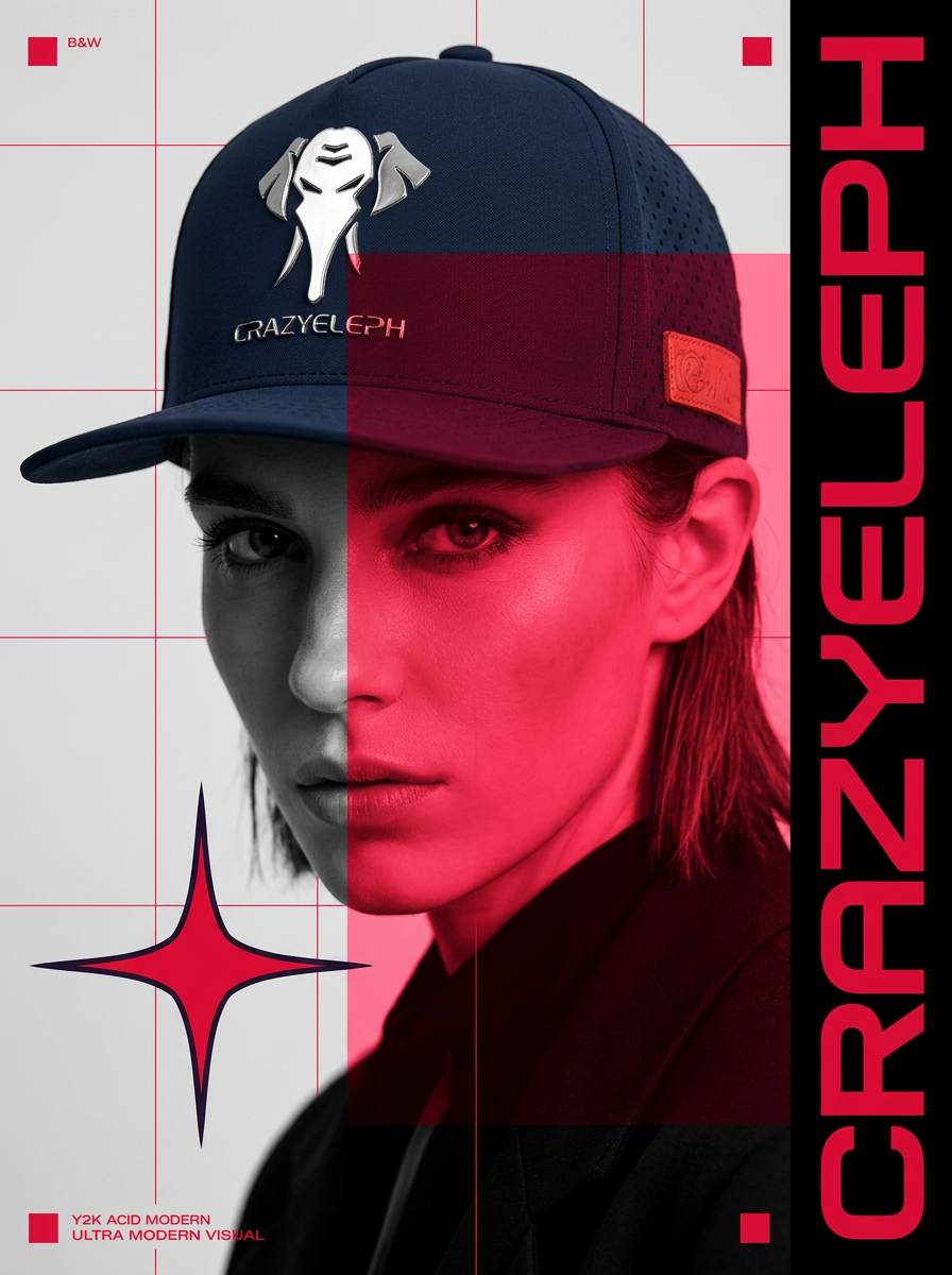
- → Each of those four is a decision, written as a sentence, before any pixel existed.
- → Each one is in the result, and each one is a line you can delete or rewrite.
- → The cap kept its silver badge, its wordmark, its perforated side panel and its tan leather tab.
That is the whole claim. Not that the picture is good — you can judge that — but that the reference arrived as named parts you can argue with, which is the step the thread was doing by hand. Try it with a reference of your own → free · two images a day
Where this stops
The description is generated, so it can be generic or wrong. It is a first draft of the reading, not an authority. The useful property is not that it is right — it is that it is in front of you in sentences, so being wrong is visible and one line away from being fixed. A silently wrong reading inside a model is the version you cannot argue with.
It says nothing about type scale or spacing, which is half of what the original question asked for. Those are UI decisions and they are still yours, and still manual.
And the second reply is right about a cost. Breaking references down by hand is how the pattern becomes instinct — that is the reason they recommend doing it, not a side effect. Having the description handed to you gets you the picture and skips the apprenticeship. For someone shipping an ad this week that is a fair trade. For someone building taste over a career it is not obviously one, and it would be dishonest to pretend the two are the same person.
You already have the folder.
Take one thing out of it and a photo of whatever you are selling. You get the reading in sentences — the layout, the colour, the type placement — and the first image built from it. Then change the sentences you disagree with.
Two free images a day. No card, nothing to cancel.
Sources.
- The thread: “How do you actually go from design inspiration to real UI decisions?”, r/Design, 19 March 2026. The question and all three replies are theirs; read on 15 September 2026.
- The reference, the plan text and the result are a public sample on swipe60.com, shown to signed-out visitors. The plan is quoted in excerpt; the full text is on the card.
- Disclosure: I build Swipe60, which performs the description step described here. The scope note and “where this stops” exist because of that, not despite it.