14 testimonial ad examples still running on Meta — none of them look like testimonial ads
Every ad below was still running on 11 September 2026. We pulled them from Meta's public Ad Library, sorted by how long they had been live, and kept only the ones past 90 days. Fourteen testimonial ads, selling everything from cowboy boots to tanning capsules. Every single one is a plain product photo. The review lives in the caption, not on the image.
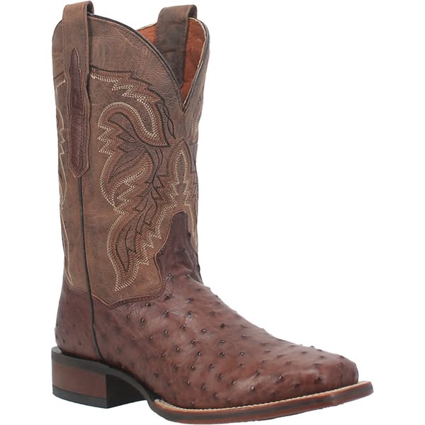
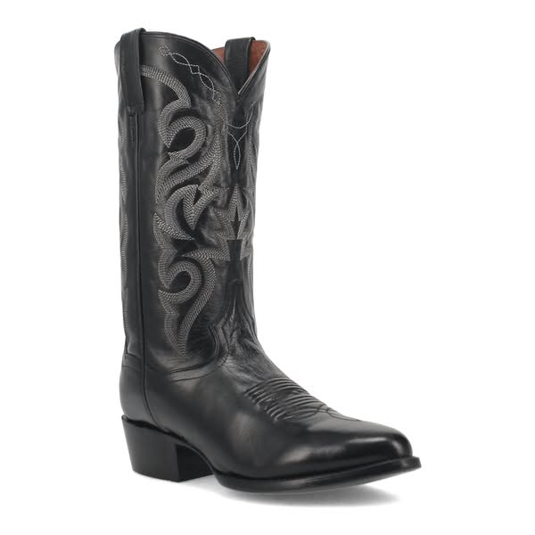
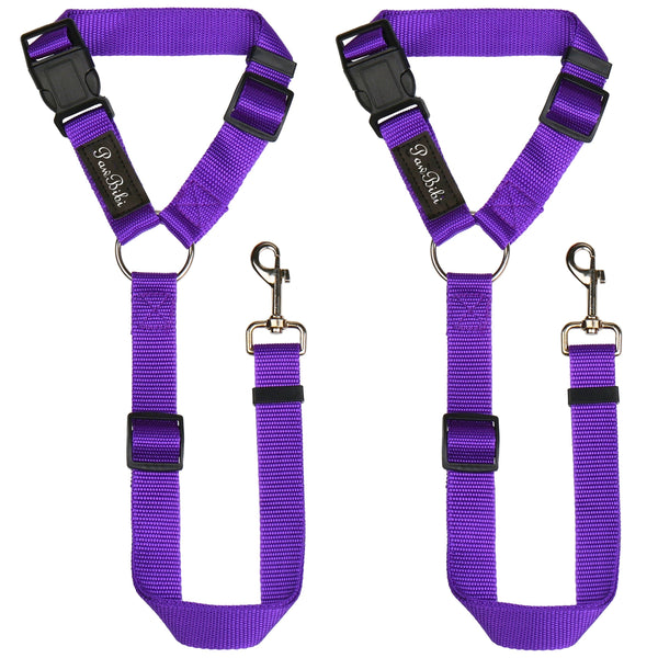
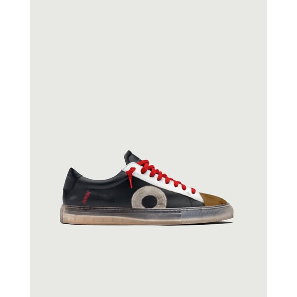

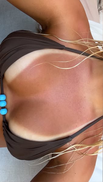
All fourteen, at the size a feed shows them. Not a headline among them.
| What the ad sells | Days running | Review on the image? |
|---|---|---|
| Cowboy boots, white background | 1,308 | no — caption only |
| Work boots, white background | 604 | no — caption only |
| Dog seatbelt, white background | 388 | no — caption only |
| Leather sneaker, pale background | 274 | no — caption only |
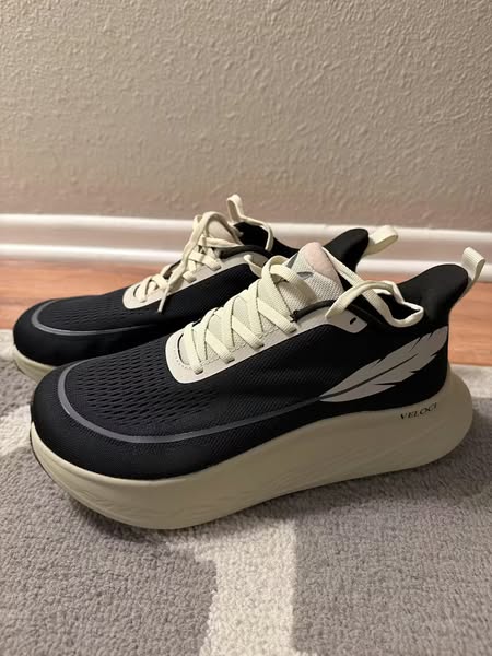
| Running shoe, on white | 252 | no — caption only |
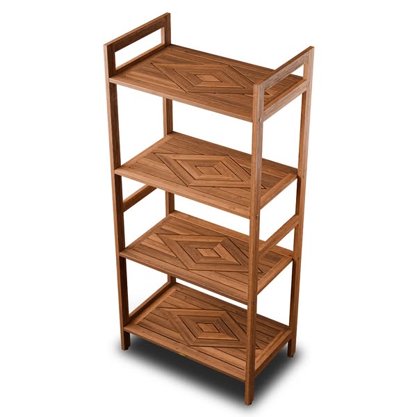
| Teak shelving, on white | 246 | no — caption only |
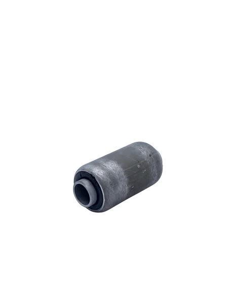
| Classic car parts, on white | 195 | no — caption only |
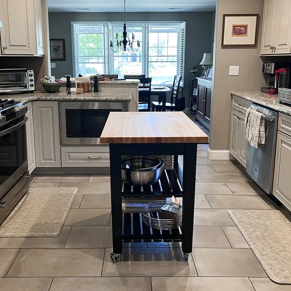
| Butcher block table, in a kitchen | 189 | no — caption only |
| Leather backpack, worn outdoors | 184 | no — caption only |
| Tanning capsules, on pink | 153 | no — caption only |
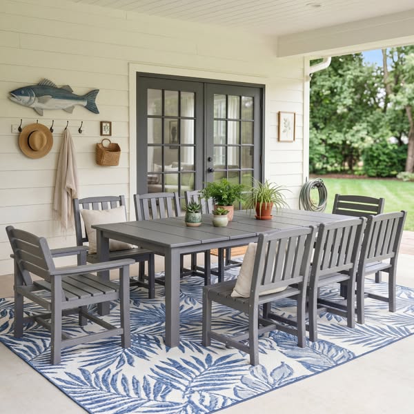
| Outdoor dining set, lifestyle | 148 | no — caption only |
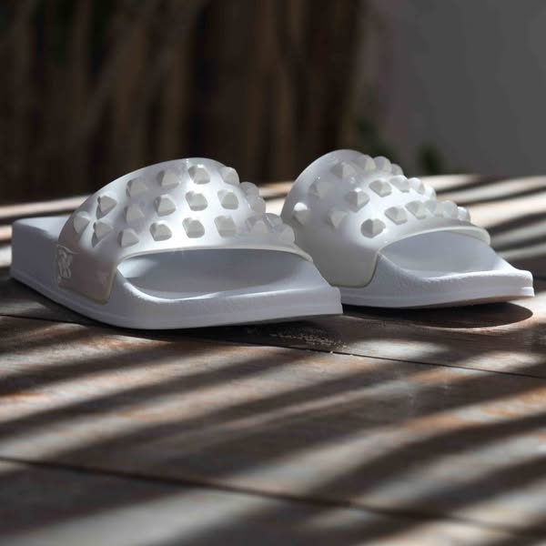
| Jelly shoes, on fabric | 139 | no — caption only |
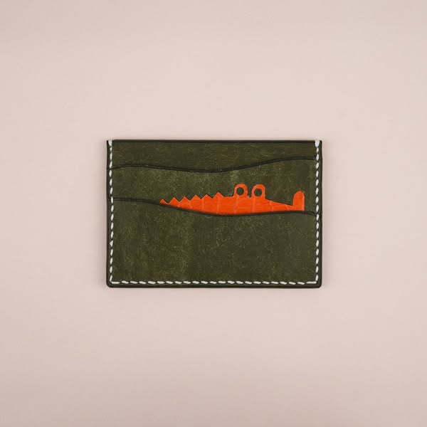
| Leather wallet, minimal | 98 | no — caption only |
| Leather wallet, narrative copy | 98 | no — caption only |
How we know they work
Meta's Ad Library is public and does not need an account. For any commercial ad it will tell you when the ad started running and whether it is running now. It will not tell you click-through rate, spend or return — none of that is published outside political advertising.
So longevity is the closest thing to a public performance metric that exists, and it is a better one than it sounds. The often-quoted figure is that only about one ad in nine survives past 60 days. The logic does not need the exact number: advertisers kill losing creative quickly, because every day a bad ad runs is money leaving. An ad still live at 300 days is one somebody has chosen to keep paying for, three hundred times.
Nine of the fourteen also carry Meta's "this ad has multiple versions" marker, meaning the advertiser is not merely leaving it on — they are still building variants off it.
The gap between the template and the feed
Search "testimonial ad" and what comes back is a template: a colour block, five stars, a customer quote set in large type, the reviewer's name and photo, maybe a product thumbnail in one corner. Every Canva template gallery shows it. Every "how to make a testimonial ad" tutorial walks you through building one. It is the shape the phrase calls to mind.
Now scroll through the fourteen ads above. Not one of them looks like that. Not one has stars on the image. Not one has a quote overlaid on the picture. Not one has a reviewer's portrait. They are product photos — boots on white, a shelf on white, a dining set on a patio — with the customer's words pasted into the caption underneath.
The testimonial ads that survive on Meta do not look like testimonial ads. They look like product ads whose caption happens to contain a review.
The gap between those two shapes is the entire subject of this article, because it is exactly the gap a person searching "testimonial ad examples" is about to fall into. You searched that phrase to make one. The template that came to mind will take you an afternoon in Canva. The format that actually runs will take you five minutes — paste the review into the caption, and spend your time on the product photo instead.
Why the review belongs in the caption
A testimonial ad has two jobs at two different moments. The image stops the scroll. The caption closes the sale. They happen in that order, and a designed quote card tries to make the image do both at once.
The problem is that a card full of text identifies itself as an advertisement instantly — faster than any word on it can be read. A product photograph does not. It reads as a product, or a picture someone took, or a thing worth looking at, until you decide it is an ad. That delay is the opening.
Once the thumb has stopped and the eye is on the image, the caption is right there. A five-star review from a verified buyer, sitting in plain text under a photograph that has already earned a moment's attention, does exactly what a designed card was supposed to do — but it does it after the scroll has stopped rather than while the scroll is being decided.
The fourteen
A cowboy boot on white, and nothing else
The longest-running testimonial ad in our set by more than double. A single cognac ostrich-leather boot, shot in profile on a white background, with a studio-grade shadow underneath. The image says nothing about testimonials, reviews or stars. The caption carries everything: a multi-sentence review about comfort, quality and no break-in period. Three and a half years live, and the ad is a catalogue photograph.
Put a different product in it
Same reference, an ordinary product photo, one generation at 1K. Nothing retouched.
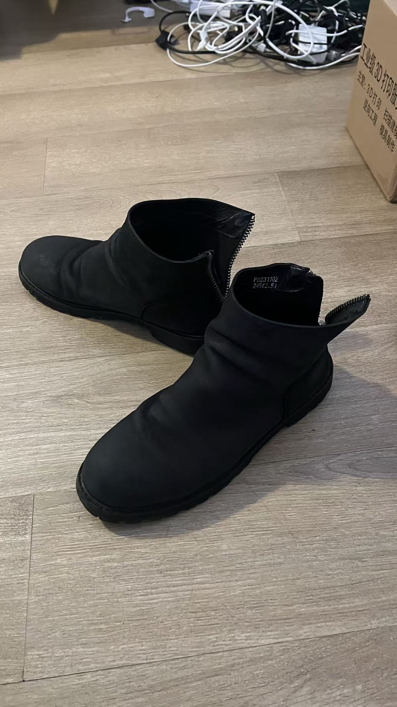
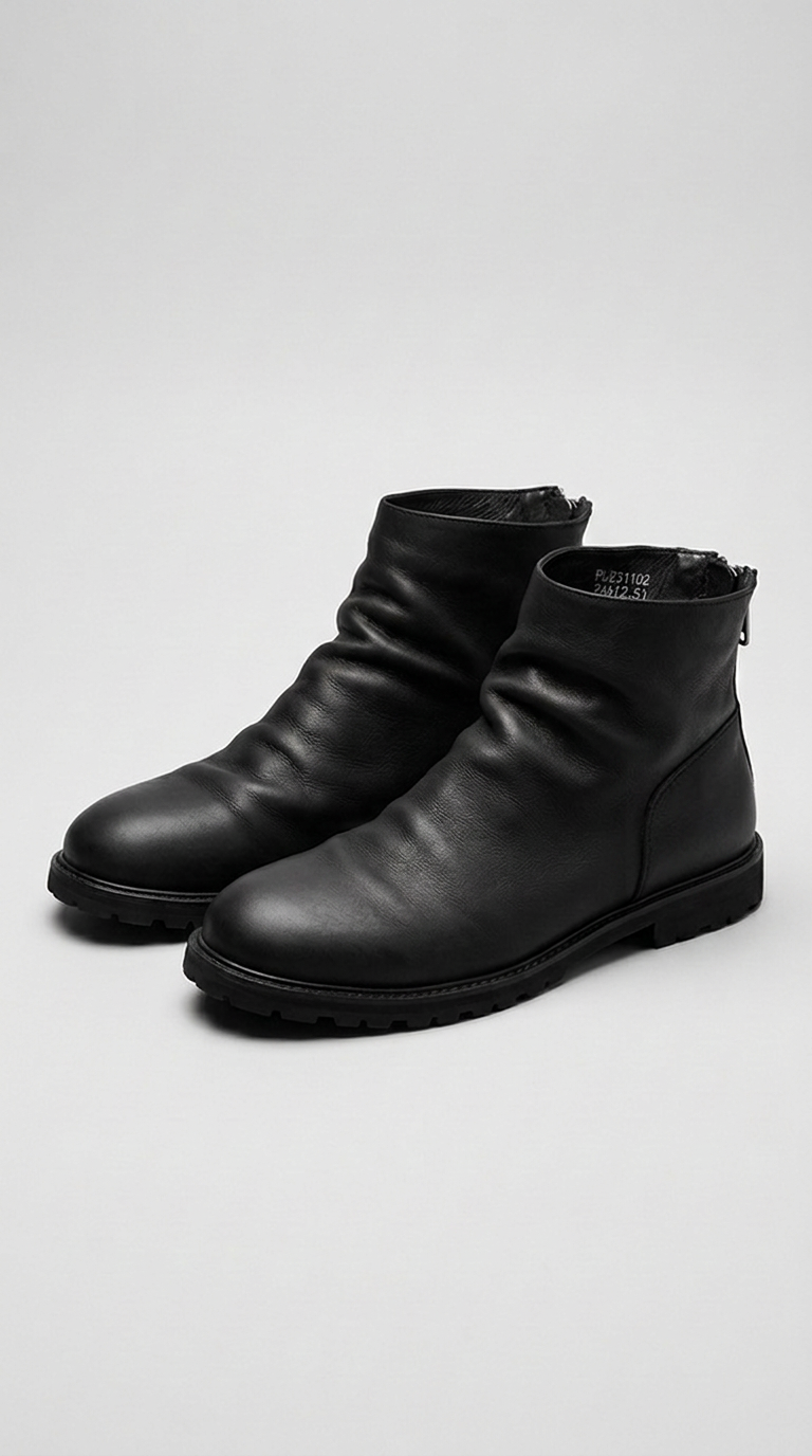
Try this reference with your own product → free · two images a day
Same brand, same format, second ad
A different boot from the same advertiser, same white background, same clean product shot. Two ads from one brand running this format simultaneously — one for over three years, one for over a year and a half — is the strongest signal that this is a deliberate, tested choice and not an accident. The review in the caption is different but the structure is identical.
A pet product that solves a problem you can see
A purple dog car seatbelt shown in two views — the harness and the clip mechanism — on a white background. The product is unusual enough to pause a scroll on its own, and the review in the caption answers the question the pause creates: does it actually work? A verified customer in New York says it does, specifically praising that the dog's legs don't get tangled. The image raises the question; the caption answers it.
A clean sneaker, and a one-sentence review that says everything
A white leather sneaker on a pale background, shot at three-quarter angle. The review in the caption is nine words long and does more work than any paragraph could: "Very stylish, very comfortable. I'm getting more." That last sentence — "I'm getting more" — is the strongest possible testimonial for any product. Not "I recommend it" but "I'm buying another one." Oliver Cabell is running three versions of this ad across different colourways, all with the same review.
A running shoe backed by someone who stands all day
A running shoe photographed on white, clean and unremarkable as an image. What gives this ad its edge is the reviewer's credential: a registered nurse. The review opens with their profession, which reframes the entire product — this is not an athlete's endorsement, it is a verdict from someone who spends twelve-hour shifts on their feet and has tried everything. The image did not need to say any of that. The caption said it better.
Furniture that earned a second order
A four-tier teak shelf unit on a white background. The product looks like what it is — solid, warm-toned, well-made furniture. The review from Gregory L., a verified buyer, does something clever: it tells a story of escalation. He bought the shower bench first, was impressed, and came back for the shelf organizer. Two purchases from one customer is stronger proof than any star rating, and the narrative carries that without needing to be designed into the image.
Niche parts for a niche audience
A replacement part for a 1940s Chevrolet, photographed on white. This is as niche as a product gets, and the review matches: Frank G. says he could not have finished his 1941 without them. When your entire audience is restoring classic cars, a testimonial from someone who just finished a build is the only credential that matters. The image shows the part; the caption shows it worked.
A lifestyle shot doing the job of a studio shot
A maple butcher block island shown in a real kitchen — dark cabinets, pendant lights, a cutting board on the surface. This is the first ad in the set that uses a lifestyle photograph rather than a white-background product shot, and it works for the same reason: the image shows the product, not a review. The five stars and one-line testimonial sit in the caption where they do not cost the image a single pixel.
Worn outdoors, with a clearance hook underneath
A canvas-and-leather backpack worn by a hiker, shot from behind at a waterfall with the falls and the river soft in the background — a lifestyle photograph that could run without any caption at all and still look like an ad. The caption layers a clearance offer ("Up to 50% Off"), the testimonial, and trust badges (lifetime guarantee, satisfaction guarantee) in that order. The testimonial is one of three reasons to click, not the only one. That stacking — visual hook, then offer, then social proof — is the most complete funnel in this set.
Put a different product in it
Same reference, an ordinary product photo, one generation at 1K. Nothing retouched.

Try this reference with your own product → free · two images a day
A product photo with proof of the result
Tanning capsules photographed on a pink surface. The image is a standard supplement product shot. The caption is where the selling happens: the reviewer describes taking two tablets a day for three weeks before a holiday, then says "here is a picture of day 2 of my hols." A review that includes a timeline and a result is doing the work of a before-and-after comparison in plain text. No graphic needed — the specificity is the proof.
The testimonial buried at the bottom, and that is fine
An outdoor dining set photographed on a patio — a lifestyle shot that does the selling before any text is read. The caption leads with the value proposition ("Why pay $3,000+?"), lists four feature bullets, and drops the testimonial into the link description at the very bottom: "Better than the expensive brands!" This is the least testimonial-heavy ad in the set, and it survives because the review confirms what the price already argues. Sometimes one line is enough.
Accessories on fabric, with a review that spans the catalogue
Jelly shoes arranged on a striped linen surface — a lifestyle product shot with warm, natural tones. The review does not describe these shoes specifically. It describes the brand: "Everything I buy from here is wonderful. I get tons of compliments on bags, shoes..." A testimonial that covers the whole catalogue is more useful to the advertiser than one that praises a single SKU, because it keeps running even after the featured product sells out or rotates.
The testimonial written like a short story
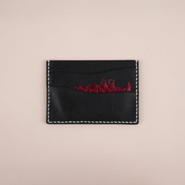
A minimalist leather card holder on a light background. The product is small and quiet; the caption is the opposite — a long-form narrative testimonial from Tyler R. in Austin that reads like copywriting: "The first Wild & King I bought, I spent a week convincing myself. The second one took about 4 minutes." This is the most written review in the set. It works because the image is so restrained that the caption has room to breathe, and a story is more believable than a star rating.
Doubt as a hook — the same brand, inverted
Same brand, same leather wallet category, but the caption is a different voice entirely: "I ordered fully expecting to request a refund the moment it arrived. Vietnam. Instagram ad. Too good to be true price." It reads like someone arguing with themselves — and the turn is that they sent a second order instead. This is the Dan Post pattern at the other end of the spectrum: two ads from one brand, both running the same image-in-caption-out split, testing different narratives against each other.
What moves, and what must not
A testimonial ad, it turns out, is two separate things glued together: a product photograph and a customer review. The photograph stops the scroll. The review lowers buying resistance. The fourteen ads above keep those two things in their natural containers — the image for the image, the caption for the words — and that separation is what allows each half to do its job without compromising the other.
What transfers from these ads is the product photo, not the testimonial. The review is yours — you already have it, in an email or on a product page — and pasting it into a caption takes seconds. The hard part is the photograph: good light, a clean background, the product filling the frame at feed size. That is the half that these fourteen advertisers invest in, and it is the half that makes or breaks whether the scroll stops long enough for the review to be read at all.
So the question is not "how do I make a testimonial ad?" — it is "how do I get a product photo worth putting a testimonial under?" A white sweep and soft light have solved that problem for most of the ads on this page. A phone photo on a kitchen table, in most cases, has not.
That gap is smaller than it used to be. You have seen it three times on this page already: the same reference photograph, an ordinary photo taken on a phone, and what came back. No studio, no sweep, no empty room — the room was borrowed from an ad somebody else had already built and tested.
The review itself — what works in the caption
The fourteen reviews above are not all doing the same thing. The patterns that show up across the longest-running ones are worth naming:
Specificity over praise. "Best product ever" is noise. "As a Registered Nurse, I've used different shoes" is signal — it tells you who this person is and why their verdict matters. The Veloci Running review, the Pawbibi review, and the Protein.com review all open with context rather than adjectives.
The repeat purchase. Three of the fourteen feature a customer who bought again: Oliver Cabell ("I'm getting more"), Teak Culture (bought the bench, then the shelf), and Wild And King ("The second one took about 4 minutes"). A second purchase is the strongest possible endorsement because it cannot be faked with enthusiasm — it requires money.
Doubt, then reversal. Wild And King's second ad opens with "I ordered fully expecting to request a refund." That doubt is doing more work than any five-star rating, because it mirrors what the viewer is already thinking. The reversal lands harder when the reader recognises their own scepticism in the opening.
You already have the review. Now make the photo.
The testimonial is sitting in a review, an email, a DM. What you need is a product photo clean enough to carry it. Pick any of the fourteen references above, upload a phone photo of your own product, and Swipe60 generates an image in the same style — a product shot with no text on it, exactly like the ones still running. Then write the review into your ad caption, where all fourteen of these put it.
Two free images a day. No card, nothing to cancel, no subscription to try it. If you want the review on the image instead, generate the clean shot first, then use Modify to place it.
Start with one of the fourteen- Meta Ad Library — start dates, active status and version markers for all fourteen ads (public, no account required)
- Ad survival past 60 days (~11%) — Superscale, Facebook Ads Library: How to Use the Meta Ad Library. Agency analysis, not published research
- The 50,000+ inactive "verified buyer" ads — same Ad Library, status filter set to inactive