13 jewelry ads still running on Meta — and 12 of them have no design at all
Every ad below was still running on 9 September 2026. We pulled them from Meta's public Ad Library, sorted by how long they had been live, and kept only the ones past 90 days. Then we actually looked at them. Twelve of the thirteen have no headline, no colour block, and no type at all.

All thirteen, at the size a feed shows them. One has type on it.
| What the ad is | Days running | Designed? |
|---|---|---|
| Chains worn on a person, face cropped | 1,882 | no type |
| Opal studs on a velvet tray, set down on grass | 1,113 | no type |
| Five tiny studs balanced along a fingertip | 945 | no type |
| Black cord bracelet, gold heart, white background | 576 | no type |
| A rail of gold bead bracelets, shot in the shop | 534 | no type |
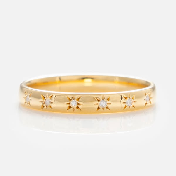
| One gold band, star settings, pale background | 463 | no type |
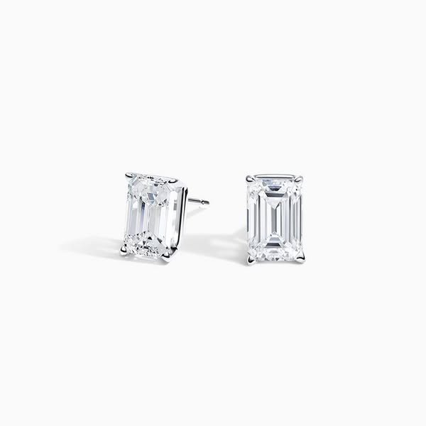
| Two diamond studs, white background | 328 | no type |
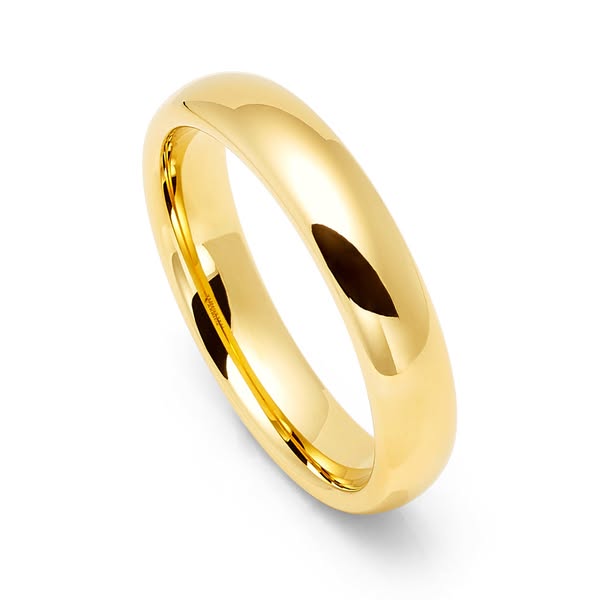
| One plain gold band, white background | 324 | no type |
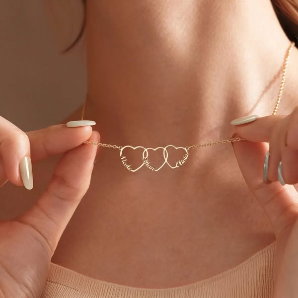
| Name necklace held at the collarbone | 320 | no type |
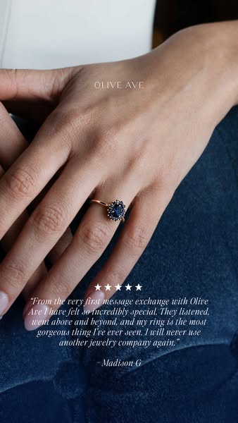
| A ring on a hand, with a customer's quote set over it | 210 | typography |
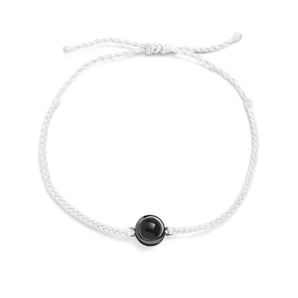
| White cord bracelet, photo bead, white background | 203 | no type |
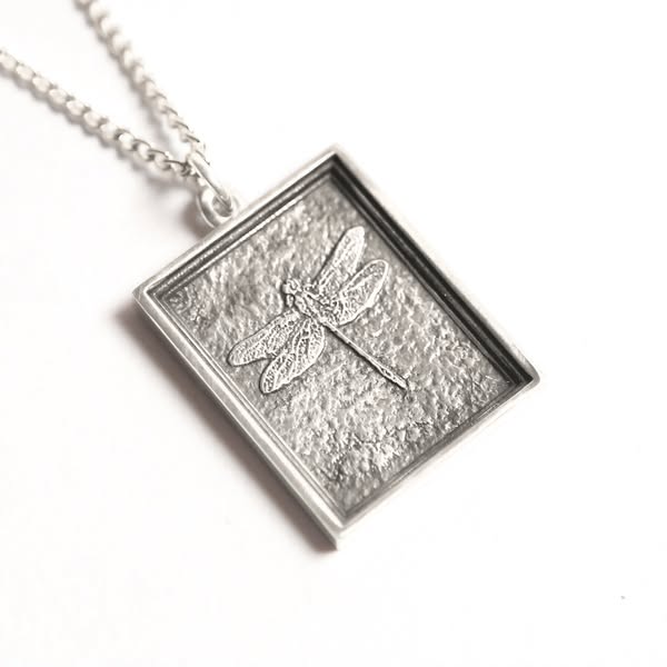
| Silver dragonfly pendant, white background | 194 | no type |
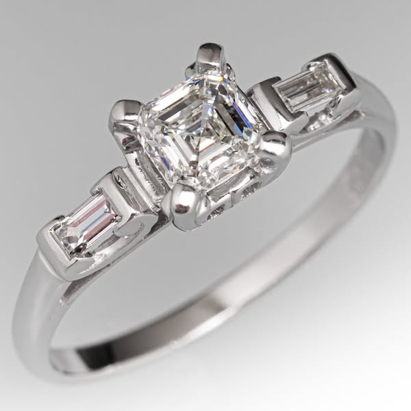
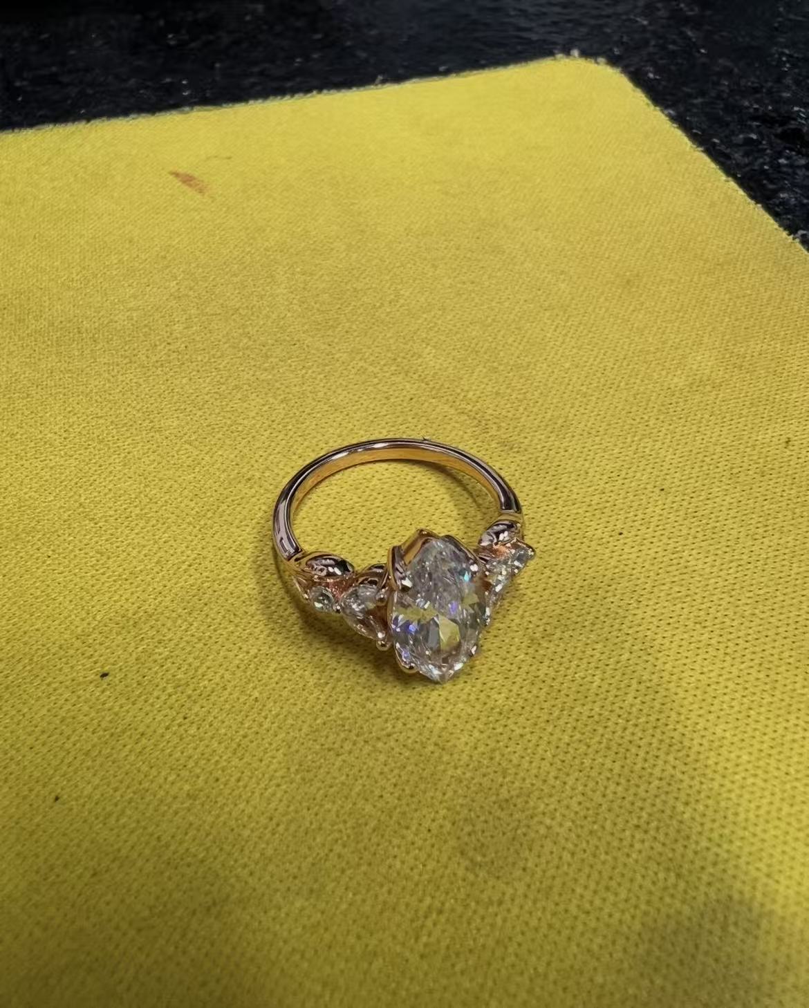
| Vintage diamond ring, grey gradient | 167 | no type |
How we know they work
Meta's Ad Library is public and it does not need an account. For any commercial ad it will tell you when the ad started running and whether it is running now. It will not tell you click-through rate, spend or return — none of that is published outside political advertising.
So longevity is the closest thing to a public performance metric that exists here, and it is a better one than it sounds. The often-quoted figure is that only about one ad in nine survives past 60 days — that number comes from agency analysis rather than published research, so take it as a rule of thumb. The logic under it does not need the number, though: advertisers kill losing creative quickly, because every day a bad ad runs is money leaving. An ad still live at 300 days is one somebody has chosen to keep paying for, three hundred times.
Nine of the thirteen below also carry Meta's "this ad has multiple versions" marker, which means the advertiser is not merely leaving it on — they are still building variants off it.
So why don't they look like ads?
Nobody decided this. That is the part worth sitting with. There was no jewelry-industry meeting where it was agreed to stop designing — and it is not that the designed ones were tried and beaten either. We went and pulled twenty-five jewelry ads that had already been switched off, to see what losing looked like. They look the same. Undesigned is not what wins in this category; it is simply what a jewelry ad is.
The decision to keep scrolling is made before the ad is read. Anything that identifies itself as an advertisement in that first glance has already lost, and layout is the fastest way to identify yourself.
A headline, a colour block and a logo lockup are recognisable as a unit at a size and speed where no individual word is legible. A photograph of a ring is just a photograph of a ring until you decide to look. The second one buys a moment the first one never gets.
Two things practitioners already say point at the same mechanism from other directions. Creative strategists at Motion describe a failure they call feed blindness: professional design makes everything balanced and beautiful, and balanced and beautiful is exactly what the eye has learned to skip. And Barry Hott has pointed out that static ads can work because almost everything else in the feed now moves — not moving is itself a thumb-stop. Both are the same rule: be the thing the feed is not currently full of.
There is also something specific to jewelry. The product is the aesthetic. Nobody buys a necklace for its features, they buy it because of how it looks, so every square centimetre given to a headline is a square centimetre taken from the only argument the ad has. A caption under the image can carry the offer; the image itself has one job.
Which makes the one exception the most useful ad here
The Olive Ave ad has been running 210 days and it is the only one of the thirteen with typography. It uses that typography to carry a customer's quote and five stars — information a photograph physically cannot hold. It is not decorated. It is a photograph plus the one thing a photograph could not say.
That is the whole rule, stated positively: design earns its place in a jewelry ad only when it carries something the picture cannot. Everywhere else in this list, it would have been subtracting.
The thirteen
Chains on a person, face cropped out
The longest-running ad we found in the category, by a factor of nearly two. It is a phone-grade photograph of three chains on someone's chest, shot in daylight against a wooden wall, with the face cropped above the lip. Cropping the face is the move: it removes the model as a subject and leaves the chains as the only thing to look at, while keeping the skin and the shadow that make metal read as metal. Five years live.
A velvet tray, set down on the grass
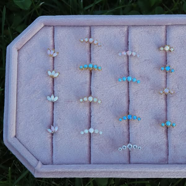
Sixteen pairs of studs in a pink velvet display tray, photographed from above with the grass still in frame at two corners. The tray says shop; the grass says someone carried it outside to catch the light. That combination is doing the work — it reads as a real person's real inventory rather than a catalogue, and the sixteen pairs answer "is there enough choice here" before it is asked.
Put a different product in it
Same reference, an ordinary product photo, one generation at 1K. Nothing retouched.
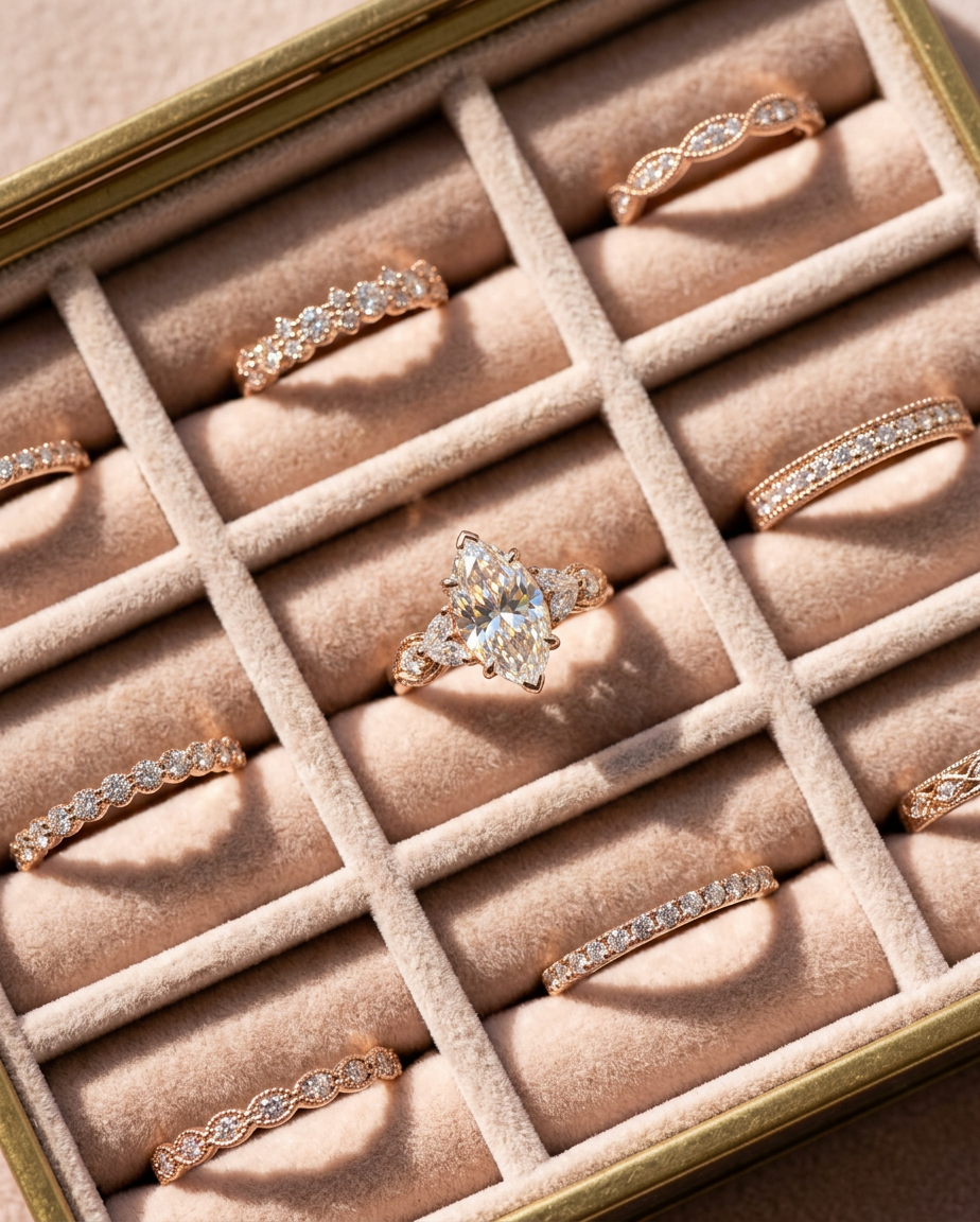
Try this reference with your own piece →free · two images a day
Five studs balanced along a fingertip
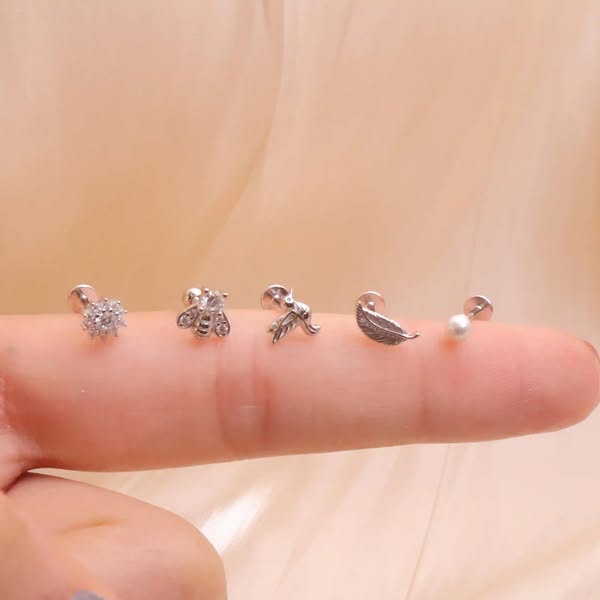
The same advertiser, and the same instinct pushed further: the products are so small that the finger has to be in shot to give them scale, and the finger is what makes it look like a message from a friend rather than a placement. Soft window light, no set, slightly soft focus at the edges. The lowest production value on this list and 945 days live.
One object, white background, nothing else
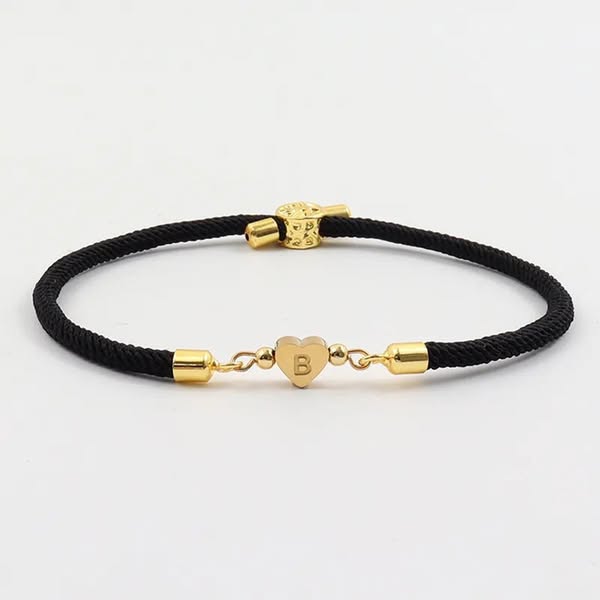
A black cord bracelet with a small gold heart, laid flat, lit evenly, cut out on white. This is a catalogue photograph running as an ad, and it has run for a year and a half. What it gets right is the crop: the bracelet fills nearly the whole frame, so at feed size the heart is still readable. Most white-background product shots fail by leaving the object small in the middle.
The stock rail, photographed in the shop
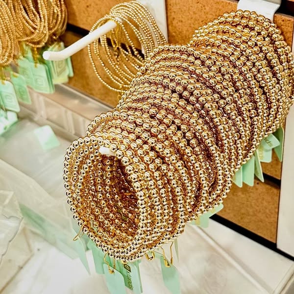
Forty-odd gold bead bracelets stacked on a display bar, shot at an angle with the shop's own mirrors and price tags visible behind. Abundance is the entire message and it needs no words: this much of one thing, in one place, reads as a business that is busy. The mint-green tags are the only colour and they land as a brand mark by accident.
One ring, filling the frame edge to edge
A gold band with six star-set diamonds, shot straight on, so wide in the frame that it is cut off at both edges. Running it off the edges is deliberate: it forces the crop past the point where the ring is an object being displayed and into the point where the engraving is the subject. The pale grey ground keeps the gold warm without competing.
Two diamond studs, and nothing whatsoever else
The largest advertiser here and the plainest picture: two emerald-cut studs on white, one turned to show the setting, one facing forward. No shadow, no prop, no wordmark. A brand with a real budget arrived at the same place a one-person shop did, which is the strongest evidence in this article that the plainness is a result rather than a compromise.
Put a different product in it
Same reference, an ordinary product photo, one generation at 1K. Nothing retouched.
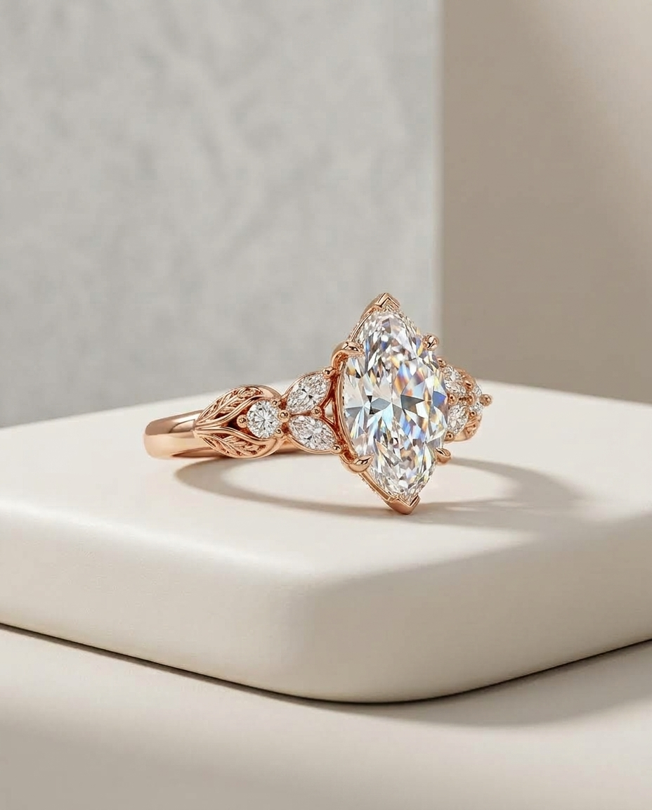
Try this reference with your own piece →free · two images a day
A plain band, lit to show it is round
A polished gold wedding band on white, tilted so the inner surface catches one long highlight. That highlight is the whole photograph — it is what tells you the metal is heavy and the finish is mirror rather than matte. Wedding bands have no features to photograph, so the only available argument is the quality of the reflection.
Two hands holding it up at the collarbone
A three-heart name necklace, held taut by two hands so the engraved names sit flat and readable against skin. Warm afternoon light, sage nail polish, no styling beyond that. Worth naming what this one costs: the idea here is partly the hands and the skin tone, and that half does not move to another product. You can borrow the light and the framing; you cannot borrow the model.
The one with type on it
A sapphire ring on a hand resting on dark denim, vertical 9:16, with the wordmark small at the top, five stars in the lower third and a customer's review set in italic serif beneath them. Every element of the type is carrying something the photograph cannot: who said it, how many stars, and the sentence itself. Remove the type and you have a nice picture of a ring; remove the picture and you have a testimonial with nothing to attach it to. This is the only ad in the set where design is load-bearing.
Put a different product in it
The layout survives whole — the wordmark, the stars and the quote block all move. Only the ring changes.
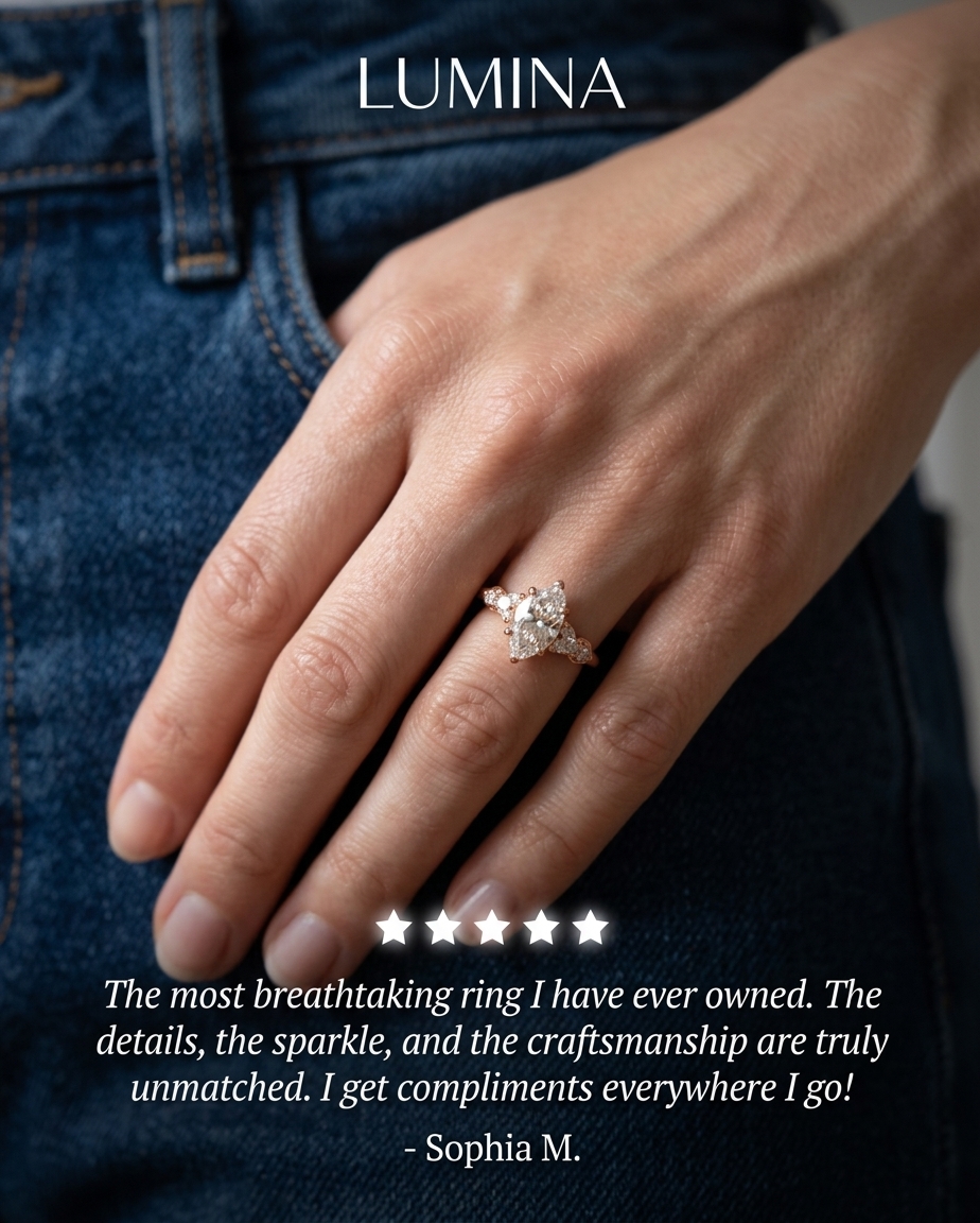
Try this reference with your own piece →free · two images a day
A product that hides what it does
A white braided cord with one small black bead, on white. The bead is a photo projection charm — the entire product is inside it and none of that is visible in the picture. The ad works anyway, which says the photograph's job here is to be clean and calm enough that the caption gets read, and the caption is where "turn your favourite photo into jewelry" lives.
Odd product, ordinary photograph
A cast silver dragonfly fossil pendant on a chain, angled on white, the chain trailing out of the top corner. The product is strange enough to stop a scroll on its own, and the photograph correctly does nothing to help — it just gets out of the way and shows the texture of the casting. When the object is the hook, the picture's job is to be legible, not interesting.
Grey gradient, three-quarter angle, jeweller's lighting
An Asscher-cut vintage ring photographed at the angle a jeweller would hand it to you, on a grey gradient that darkens behind the stone so the facets separate. This is the most technically careful photograph in the set, and it is still not designed — the craft went entirely into the lighting.
So the hard part is the part that looks like nothing
None of these thirteen would be improved by a headline; several would be ruined by one. What they have in common instead is the thing that photographs as absence — even light, an honest background, a crop tight enough that the piece survives being three centimetres tall in a feed.
That is easy to write down and difficult to do. A plain white background is one of the harder photographs there is, as anyone who has tried it on a kitchen table finds out inside twenty minutes: the white goes grey, the metal picks up the colour of the room, the shadow under the piece turns hard and blue, and the phone focuses on the tablecloth. The reason those two studs look like nothing at all is that a considerable amount of equipment was pointed at them.
Which means a jewelry ad is made of two things with very different prices. One is the idea — what it sits on, how tight the crop is, whether a hand is in the frame, where the light comes from. There are thirteen of those above and every one of them is free; you could write them on a napkin tonight. The other is the room: the sweep, the distance, the lamp, four walls with nothing else in them. That is the half a small seller cannot buy, and it is the half that has quietly decided this for years.
What changed recently is that the second half stopped being a purchase.
You have seen it happen three times already on this page, under numbers two, seven and ten: the same reference, an ordinary photo taken on a phone, and the picture that came back. No sweep, no lamp, no empty room — the room was borrowed from an ad somebody else paid to build.
What moves, and what must not
If you sell jewelry you have a specific fear about anything generative, and it is not an aesthetic one. It is that the picture comes back with five stones instead of four, or bezel settings where yours are prongs, or a cable chain where yours is rolo. A beautiful image of a piece you do not sell is not a nice-to-have problem. It is a complaint, a return, and a customer who now thinks you exaggerate.
So the split matters more here than in almost any other category, and it is worth stating plainly. The reference supplies the room. Your photo supplies the piece. What gets taken from the ad you picked is the treatment — the surface it sits on, where the light comes from, how far away the camera is, how tight the crop runs, what is behind it. What has to survive untouched is everything that makes the piece the one you actually ship: the stone count and cut, the setting, the link, the clasp, the engraving, where your mark sits.
It is not magic and you should check it. Small detail at small size is where anything drifts first — a hallmark, a maker's stamp, a line of micro-pavé. So look at the piece, not at the picture: hold your own photo next to the result and count. If something is wrong, generating again costs one image, not an afternoon and a reshoot. That is the actual reason the first one is free — you are supposed to check it before you trust it.
Take the room. Keep the piece.
Pick any of the thirteen above, add a photo of your own piece from your phone — on a table, in whatever light the room has — and Swipe60 reads what the reference is doing and builds the same picture around yours. A white sweep, soft window light, a velvet tray set down on grass: they are all just rooms, and it does not much matter which one you point it at.
Two free images a day. No card, nothing to cancel, no subscription to try it. If the first one comes back wrong, the fix is a sentence — not an afternoon.
Start with one of the thirteen- Meta Ad Library — start dates, active status and version markers for all thirteen ads (public, no account required)
- Ad survival past 60 days (~11%) — Superscale, Facebook Ads Library: How to Use the Meta Ad Library. Agency analysis, not published research
- The twenty-five switched-off jewelry ads used as a check — same Ad Library search, status filter set to inactive
- Feed blindness from over-polished design — Motion, Static Ads Playbook
- Static as thumb-stop in a video feed — Barry Hott, public post on static Facebook ads